Crafting a visual story for a community library

Learn how Redstamp discovered the heart of Coquitlam Public Library to create a balanced logo that showcases its values of inclusion, curiosity, and love of learning.
Amongst the bookshelves in Coquitlam Public Library, there’s more than a collection of stories — there’s a springboard for boundless discovery and community engagement. But the library's existing logo didn’t capture its vibrant spirit and focus on inclusion. The team turned to Redstamp to tell a new visual story that mirrors the library's mission to nurture joy through inviting, innovative spaces and services.

Weaving a welcoming narrative
Redstamp’s strategy unfolded like a story, starting with the main characters that would best bring the library’s essence to life: vibrancy and community.
The new logo needed to be bold enough to draw readers in, with a warmth that celebrated the people who make the library a safe haven for all. The perfect logo would wrap its arms around everyone as a symbol of belonging and shared experiences.
To capture the library’s vision, Redstamp embarked on a “reverse brief” journey, listening intently, brainstorming, and synthesizing the library’s desires. We then sketched a wide range of ideas internally and created the ideal narrative to tell the library’s story.


Bringing a local library to life through colour and form
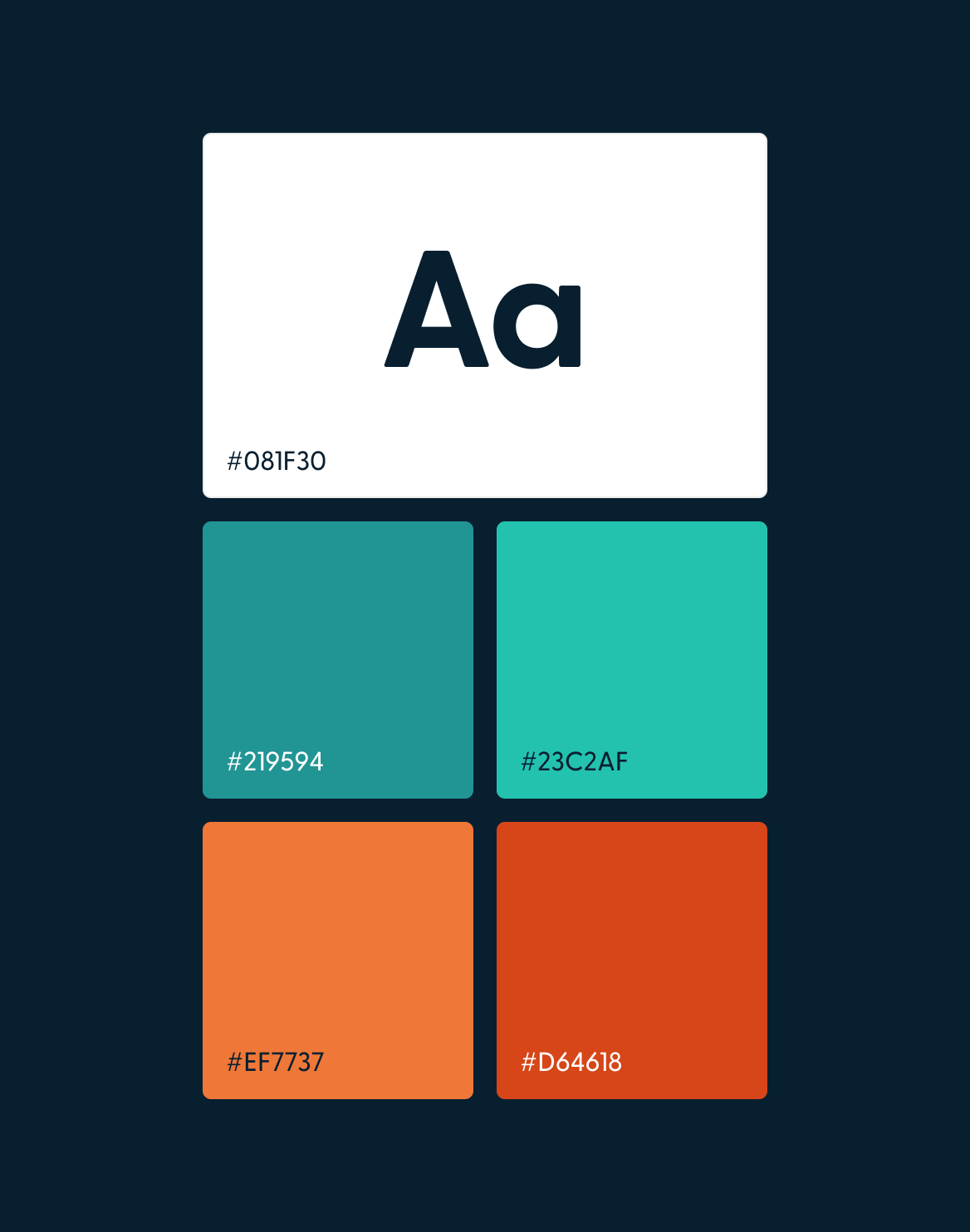
The initial concepts were bursting with elements, from books, fish, bookmarks, and digital symbols, but feedback pointed towards simplification. The final design became a harmonious balance where colour was the voice of the logo and form was the storyteller. The library embraced a nature-inspired palette, with calming greens complementing salmon-like hues to give a nod to the local environment. Subtle hints to “Quitlin,” which means “redfish out of water,” further weave the local community into the library's visual identity, making the updated logo feel like a fresh coat of paint to a familiar space.


Vibrant visuals tell an inclusive story
“We love it. Thank you so much for managing this new chapter for the library. It’s great to be turning over a new page internally, with our new ED and leadership team, as well as visually for the public. I am sure this ‘narrative-rich’ design will spark many conversations, as well as reinvigorate our place in the everday stories of Coquitlam residents.”


.svg)

.svg)
